
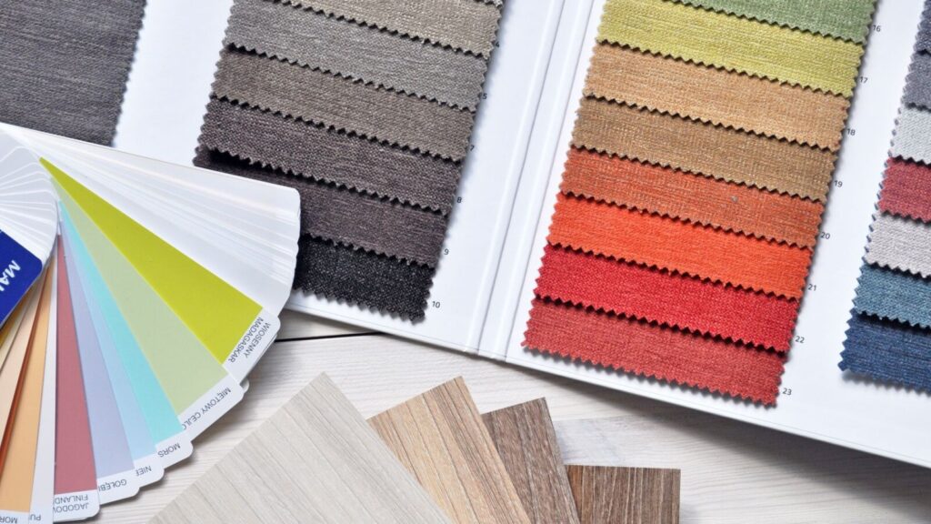
Choosing a colour palette can feel straightforward until the samples arrive. A beige that looked calm online turns pink beside the floor, a white feels stark at night and a favourite green does not sit comfortably with the sofa. These surprises happen because a colour is always seen alongside other surfaces and under particular lighting.
The perfect colour palette for your home is one that works with what you already have and feels right when you use the rooms. Start with the fixed finishes, decide on the atmosphere you want and test a small group of colours in place. You can build a connected scheme without painting every room the same shade.
Begin With the Finishes You Are Keeping
Look at flooring, cabinetry, worktops, tiles and any large furniture that will remain. These occupy substantial areas and may have stronger colour undertones than you first notice. A warm timber floor, for example, influences which whites and greys feel comfortable beside it.
Gather samples or clear photographs of the permanent materials, but use the real surfaces for final comparisons. Sherwin-Williams’ guidance for open-concept homes recommends letting fixed elements inform the palette. It is a practical starting point whether you are decorating one room or several connected spaces.
Describe the Mood in Everyday Language
Choose a few words that explain how you want the home to feel, such as quiet, cheerful, earthy or dramatic. Then connect those words to specific rooms and activities. A bedroom used for winding down may need a different balance from a lively family kitchen.
Keep the description personal rather than treating colour as a guaranteed emotional formula. The same shade can feel different depending on the light, surrounding materials and your own associations. Your response to the samples matters more than a rule claiming one colour suits everyone.
Find One Starting Point You Already Love
A painting, rug, patterned fabric or view into the garden can suggest a useful family of colours. You do not need to copy every colour in that starting point. Choose the few that work with the permanent finishes and the mood you have identified.
For example, a print containing muted green, warm cream and dark brown could become a quiet wall colour, natural upholstery and a deeper accent. The relationship between them gives the room direction. Keep the original item nearby while you compare new samples.
Learn to See Undertones by Comparing Colours
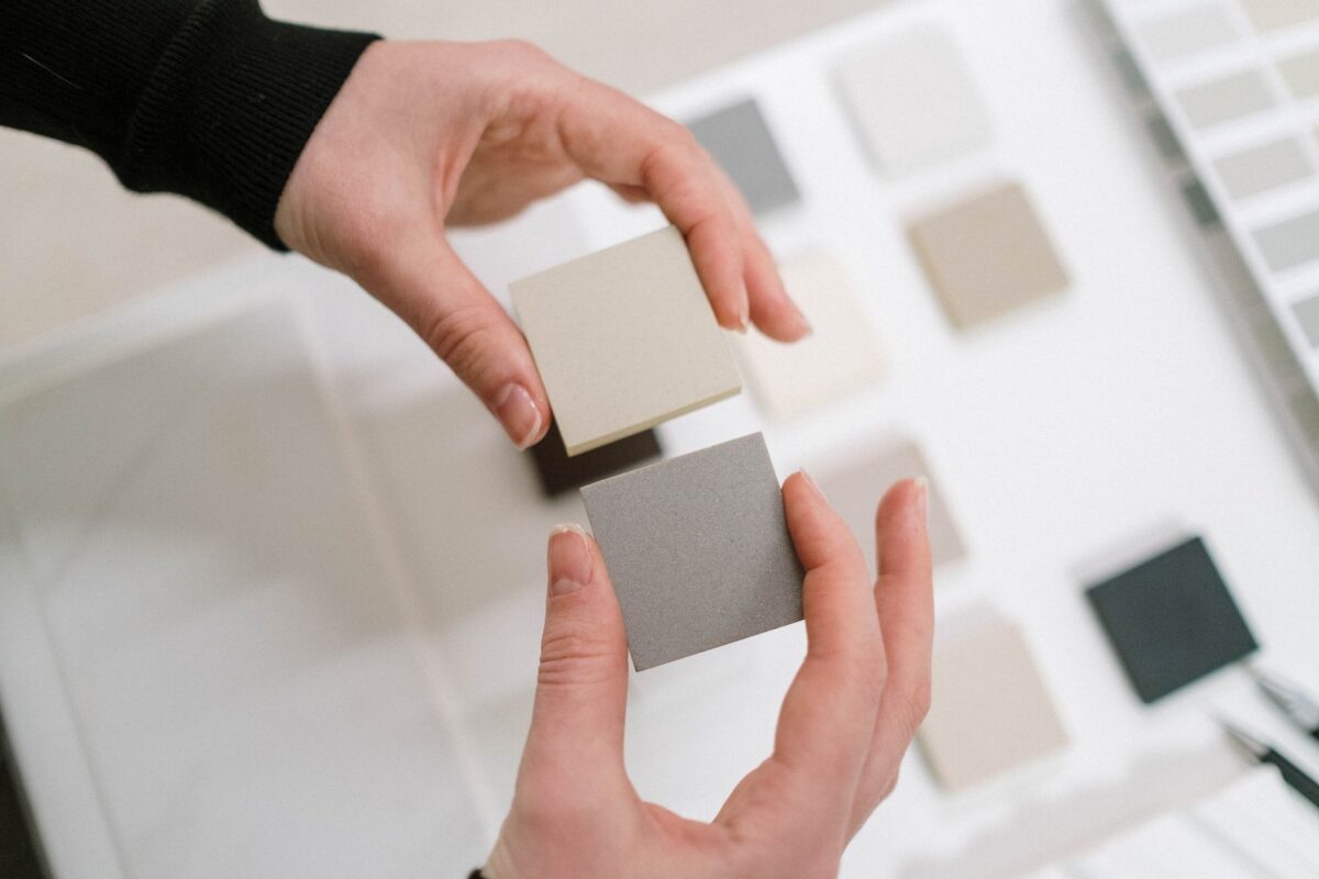
A neutral can lean towards pink, yellow, green or another subtle colour. That undertone is often easier to see beside another neutral than on an isolated swatch. Put the samples next to the floor, sofa or tile you need them to work with.
If one combination feels uncomfortable, do not immediately discard the whole colour family. Try a different undertone or a slightly different depth. Our neutral living room ideas explain how these small relationships affect a restrained room.
Choose Roles for the Colours
It helps to decide which colour will occupy the largest area, which will support it and which will provide a smaller accent. These roles can be filled by existing materials as well as paint. A timber floor or a large sofa is already contributing to the scheme.
You do not have to calculate exact percentages. Instead, notice whether every colour is asking for equal attention or whether the room has a clear background. Give the stronger accents enough space to be appreciated without repeating them on every surface.
Use Light, Middle and Dark Tones for Definition
A connected palette can still include contrast. Pale walls, medium-toned timber and a dark frame can give a room definition without adding a bright accent colour. Conversely, a dark wall may work well with lighter upholstery and a few warm details.
Look at a photograph of the room to judge the balance of these large areas. If everything appears to merge together, one deeper or lighter element may help. Make that adjustment with a sample or something you already own before buying several new accessories.
Test Colours in the Light You Actually Use
View samples during the morning, afternoon and evening, including under your usual lamps. Place them on more than one wall because different surfaces receive different light. Give yourself enough time to notice the colour when you are using the room normally.
Benjamin Moore’s paint sampling guidance recommends checking colours in different lighting and explains how sample options can be used. Follow the sample product’s instructions and remember that test paint may not have the performance of the final wall coating. Confirm the final product and sheen before painting the whole room.
Plan the View Between Adjoining Rooms
Stand where you can see more than one space at a time. The colours visible together need a relationship, even if each room has its own character. You might repeat a warm white, a timber tone or a muted accent to connect them.
Draw a simple floor plan and note the main colours in each area. This can reveal an awkward transition before any painting begins. Rooms that are visually separate can take a different direction more easily than several walls seen together across an open plan.
Bring Texture Into the Palette
Colour does not arrive only as a painted surface. Woven fabric, glazed pottery, wood grain and brushed metal each contribute a different texture and reflection. A room can feel layered when those surfaces vary, even if their colours are closely related.
Compare the materials together rather than approving each one on its own. A smooth curtain may need a more textured cushion, or a strongly grained table may work best with simpler surrounding fabrics. Let the existing pieces guide the balance.
Try a Palette as a Small Arrangement First
Gather a few representative items on a board or table: the wall sample, a fabric, the floor finish and one possible accent. Keep the group small enough that you can see the relationships clearly. Remove anything included only because you feel the room ought to have more colours.
Then place the samples back in the room where they belong. A beautiful collection on a desk can still feel wrong beside the actual sofa. Use the board to organise your thinking, with the room providing the final check.
Use These Combinations as Starting Points
The following examples illustrate possible colour relationships rather than ready-made schemes for every home. Adjust the undertones and proportions to suit the finishes and light you have. Test the combinations in place before ordering paint or fabric.
| Direction | Main background | Supporting materials | Small accent |
|---|---|---|---|
| Warm and quiet | Soft cream | Oatmeal fabric and medium timber | Deep brown |
| Garden-inspired | Muted warm white | Gentle green and natural wood | Terracotta |
| Cool and tailored | Soft grey | Blue-grey fabric and a suitable wood tone | Charcoal |
| Rich and intimate | Deep muted colour | Warm neutral upholstery | A restrained metallic or pale detail |
If one direction appeals to you, begin with a colour already present in the room and build around it. There is no need to replace everything to make the palette work. If you are refreshing the room gradually, our budget living room decorating guide can help you put the colour decisions into a practical spending plan. The scheme should help you make clearer choices with what you own.
Avoid Buying Every Accent at Once
Once the large surfaces are decided, add small colours gradually. Try a cushion cover, an existing vase or a framed print and see whether the room needs more. Repeating an accent lightly can be enough to connect the arrangement.
Keep a note of the approved paint name, finish and product alongside fabric samples and purchase details. This makes later additions easier to compare. It also helps you avoid collecting several almost-matching whites or metals that feel disconnected when placed together.
Frequently Asked Questions
How many colours should a home palette include?
There is no fixed number. Start with a manageable group that includes the main surfaces and existing materials, then add accents only where they help.
Should every room use the same wall colour?
No. Connected undertones, repeated materials or a shared accent can create continuity while allowing rooms to have different wall colours.
Can warm and cool colours work together?
Yes. Compare their depth, undertones and proportions in the room so the contrast feels deliberate rather than accidental.
Why does paint look different from the sample online?
Screens, lighting, neighbouring surfaces and the finish all influence appearance. Use physical samples in your own room before making the final decision.
What should you choose first?
Begin with fixed finishes and large items you are keeping. Choose paint and smaller accents around those elements rather than treating them separately.
Build a Palette You Enjoy Living With
A successful colour palette grows from the home you have, the light it receives and the atmosphere you want. Compare undertones, assign colours clear roles and give yourself time to test the combination. The result should feel connected and personal, with enough flexibility to change as your home develops.